Overview
Weather General is a weather startup and a client of Startup Aggieland incubator. The founder and CEO Neil "Doc" Sanger is a veteran in the field of meteorology and he wanted to provide more accurate weather information using proprietary data. When he followed the lean startup methodology he discovered a niche market in small business such as event planners and farmers who were at the mercy of weather conditions when they planned their activities sometimes leading to thousands of dollars in lost revenue. the Weather General team therefore pivoted and targeted this new market segment. They created a prototype to communicate their needs to the developers.
The Problem
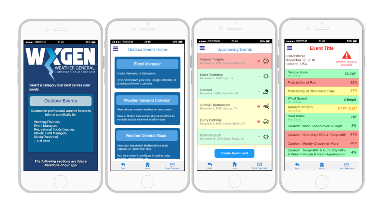
I spoke to the team after the meeting and asked to see the prototype. Their design had functionality and usability and captured all the nuances of the product but it didn’t communicate the business model in an elegant way and the product had to be explained to the customers. I asked them what the customers said about the prototype
I needed to explain how to use the app once, but after that they love it!

Design Process
Fixing the Taxonomy
I sat with them to understand their business model and got their customer interview data and analyzed the problem. I first created a taxonomy of their existing prototype and brainstormed with the team on alternative taxonomies based on them. After getting the team's input I sat with a few users and asked them to sort the layout according to where they expected to find them. Users Clearly indicated that they wanted information related to current weather and their events to be front and center in focus. I further applied Ben Schniderman’s mantra and came up with the taxonomy and prototype ideas below
Overview first, zoom and filter, then details on demand.
Design ideation
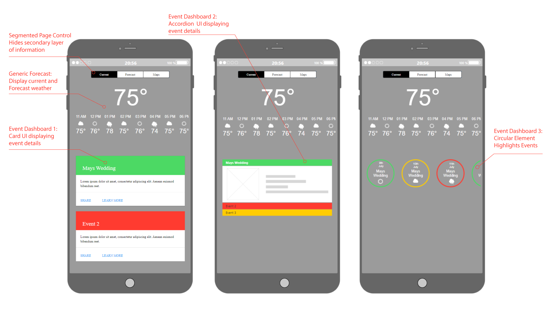
The first design iteration involved, having a fixed current weather display while adopting the android card UI to display the event dashboard

Whiteboarding
The first issue that popped up was the necessity to keep all the details visible at all times in this layout, which reduced the number of events that can be seen immediately, further the WxGen team wanted to make the events color coded to facilitate simple status checks. This prompted me to propose a expanding card UI to show both status and enable viewing details on demand
The previous design was well received but I was not satisfied, I was inspired by the goal meter of my misfit and proposed a redesign of the event dashboard that incorporated a way to display a progressive change in status
Wireframes
The final design came together based on the above ideas. The designs were wireframed and presented to users for usability testing

User Feedback
On a wedding day there are a thousand things that can go wrong, I need to be on top of all of it.
Initial Prototype
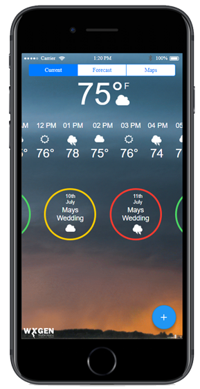
At the end of the A/B testing, The users indicated that they preferred the circular design, This was then chosen to implement the Initial prototype, on which I implemented a progressive indicator

However, at the final testing, two users indicated confusion over the progressive event status sliders therefore the slider was removed in favor of discrete circles that varied from green or yellow to red
Results

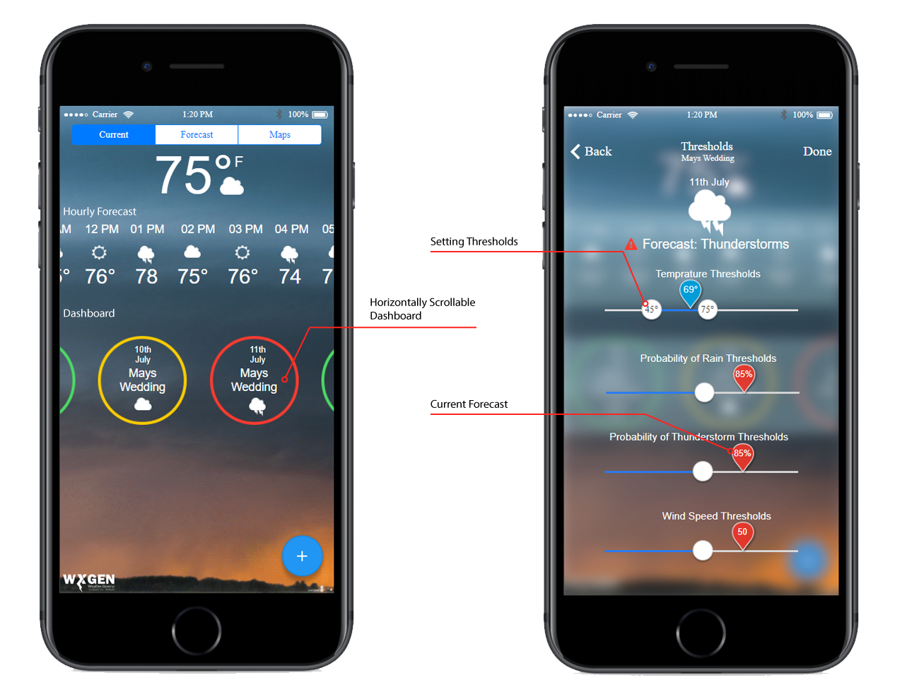
The rule of thumb in the entire graphical design process was to keep the design simple and familiar while incorporating WxGen's unique value proposition. While reusing a generic weather app theme, I added in a horizontal-scrolling dashboard which would let the customer see at a glance about what they needed to know. They could also click on an event and get more information, alter thresholds and other variables as needed. This new design was well received by the team and their customers and Weather General has since received funding to take their product to the next stage